Wednesday, February 12, 2020

Why are Climate Scientists Lying to Us?

Climate scientists claim that observed warming of the planet over the last 40 to 50 years by about +0.16 deg. C per decade is a direct result of the increase in atmospheric CO2 caused by human emissions.

HERE IS WHY THEY ARE WRONG!!

A. Annual to Bi-annual Temperature Increases and Decreases in Global Temperature 

Figure 1 shows the University of Alabama - Hunstville (UAH) satellite-based lower troposphere temperature anomalies for the Tropics (+/- 20 deg. longitude) between December 1978 and January 2020.

What this graph shows is that the mean temperature anomalies for the lower troposphere of the Earth's Tropics exhibit a linear warming trend of +0.13 deg. C per decade (red dashed line), with sharp increases and decreases in temperature of approximately +/- 0.5 deg. C about the long-term trend, lasting for one to two years.

Figure 1.
It is well known that the annual to bi-annual excursions in temperature, above the long-term trend, are associated with El Nino and those below the long-term trend with La Nina events. The proof of this assertion is provided in Figure 2. This figure is a reproduction of figure 1 with a superimposed red curve showing the Bivariate EnSo Time Series (BEST) Index between 1979 and 2019. The BEST index has a value of +1 during El Nino months and -1 during La Nina months.

With one notable exception i.e. the 1991-92 El Nino event, all of the other identified El Nino events are followed by noticeable warming in the UAH temperature anomalies. Similarly, all of the identified La Nina events are associated with noticeable cooling in the UAH temperature anomalies.

[N.B. It generally accepted that the warming following the 1991-92 El Nino event was masked by a significant cooling event that was caused by the 1991 Pinatubo volcanic eruption.] 

Ref: https://www.esrl.noaa.gov/psd/people/cathy.smith/best/

Figure 2.

This means that El Nino and La Nina events can explain almost all of the short-term (i.e. annual to bi-annual) increases and decreases in global temperature about the observed longer-term linear trend of +0.13 deg. C per decade. In addition, the rare exception to this rule can be explained by cooling events that are associated with large volcanic eruptions in the Tropics.

B. The Long-Term (Decadal to Inter-Decadal) Linear Increase in Global Temperature 

Hence, we are left with a gradual linear increase in Earth's tropical temperature of approximately +0.13 deg. C per decade over the 40-years of the UAH (satellite) temperature record.

If we extend the global temperature record to the whole globe, rather than just the tropics, we find that between 1979 and 2012, the linear warming trend for the combined land and sea temperatures has been +0.155 ± 0.033 deg. C per decade according to the AR5 IPCC report (Ref: AR5 IPCC WG1 Chapter 2 p. 93)


Most climate scientists attribute much of this gradual increase in global temperature to human-induced climate change. However, the scientist's claims must be examined in light of other available temperature records that extend over a greater period of time. One such atmospheric temperature record is the HadCRUT4 produced by the Climate Research Unit (University of East Anglia) in conjunction with the Hadley Data Centre (UK Met Office).

The black curve in figure 3 shows the time-rate-of-change of the world mean HadCRUT4 temperature (i.e. (dT/dt) - also known as the velocity of warming - measured in deg. C per year). Superimposed upon the black curve, is a purple horizontal line showing the average warming rate between 1979 and 2012 of +0.16 deg. C per decade, claimed by the IPCC (AR5).

What is immediately clear from this graph is the linear warming rate of +0.16 deg. C per decade is only a crude approximation of what actually happened in the real world between 1979 and 2019. The longer global temperature record shows that the actual warming rate for the world's mean temperature varied up and down in a sinusoidal manner between a minimum of roughly -0.02 and a maximum of +0.20 deg. C per decade. It only averaged 
0.16 deg. C per decade during the period between 1979 and 2019.

Contrary to the observed temperature data, the climate models indicate that the CO2 forcing of the atmosphere should be producing a steady increase in the rate of warming of the Earth's atmosphere with time [i.e. a straight line with a positive slope in figure 3]. This is particularly true after the end of WWII when CO2 levels begin to significantly increase because of human emissions. However, what is observed is at complete odds with the prediction of the models.


Hence, this post conclusively shows that anthropogenic CO2 cannot be the primary forcing term for the recent observed increases in the world's mean atmospheric and oceanic temperatures.


Figure 3


For supportive arguments, please read my earlier post entitled:

GAME OVER! This Madness has to end!


https://astroclimateconnection.blogspot.com/2020/01/game-over-this-madness-has-to-end.html

Friday, January 17, 2020

GAME OVER! This Madness has to end!

Climate scientists insist that rising atmospheric CO2 concentrations (measured in parts per million or ppm) are forcing the Earth’s atmospheric and oceanic temperatures to increase. They base their claim on the premise that CO2 is a greenhouse gas that prevents infrared light from escaping the Earth’s atmosphere. They propose that the trapped infra-red radiation results in a net gain in the energy that is stored in the Earth’s atmosphere (~ 2 %) and oceans (> 90 %).
The scientists quantify this build-up in energy using a parameter called the Earth’s [top of the atmosphere] Energy Imbalance (EEI). If the EEI is positive then the Earth’s climate system gains energy, if it’s negative then the system loses energy, largely due to the energy flow into and out of the oceans.
The best estimates of the observed EEI at the moment are about 0.8 watts per square metre (W m^-2). Many scientists implicitly assume that this energy imbalance is caused, in large part, by anthropogenic GHGs. Theoretical climate models indicate that if you take into account GHGs, ozone, the Earth’s albedo, aerosols, and solar irradiance, the net anthropogenic forcing component upon the Earth’s climate system should be about 1.6 +/- 0.8 W m^-2.
It is important to understand that climate scientists treat the rising atmospheric CO2 concentrations as a “forcing” upon the climate system. They measure the effect of this “forcing” in units of W m^-2 [i.e. joules (of energy) per second per metre^2]. This means that we need to look for a response to this “forcing” of the Earth’s atmosphere and oceans by CO2 in units that match that of the “forcing” itself i.e. watts or joules (of energy) per second [N.B. the m^-2 part of the units is superfluous because we can integrate of the entire area of the Earth’s surface]. Effectively, what this means is, that at time scales longer than about a year, the time-rate-of-change ocean heat content (d(OHC)/dt) should provide the most reliable indicator of the EEI.
Climate models indicate that the net EEI should become increasingly positive with time, as CO2 concentrations slowly increase. If this is the case, you would expect that the total energy content of the Earth’s oceans (e.g. from 0 to 2000 m) to increase at an ever-increasing rate with time. Note that this is the same as saying that the d(OHC)/dt (for 0 to 2000 m – measure in Zeta joules = 10^21 joules) should become increasingly positive with time, as well.
However, what if this is not true? In this case, it would bring into question CO2’s role in the forcing of the increasing world mean temperatures in recent decades.
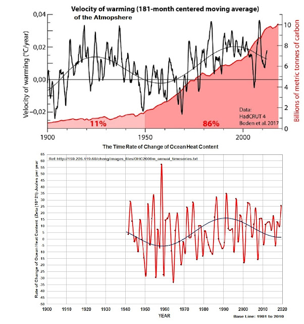
The bottom graph in the following diagram shows the time-rate-of-change of the (0 to 2000m) OHC between 1940 and 2019.
h/t to Javier

The OHC data is available at:
References:
[1] Cheng L. and J. Zhu, 2016, Benefits of CMIP5 multimodel ensemble in reconstructing historical ocean subsurface temperature variation, Journal of Climate. 29(15),5393-5416
[2]Cheng L. Et al., 2017: Improved estimates of ocean heat content from 1960 to 2015, Science Advances, 3,e1601545.
What this bottom graph shows is that, contrary to the predictions of the climate scientist, the mean observed time-rate-of-change of the (0 to 2000 m) OHC actually decreased between 1940 and 1960, as well as between 1990 and 2019. It has only systematically increased for the 30 years between 1960 and 1990.
However, the top graph in this figure clearly shows that CO2 levels have been rising steadily since the end of WWII (with 86 % of all CO2 added to the atmosphere occurring after 1950). Hence, the increasing concentration of CO2 has been steadily applying a forcing to the Earth’s climate system, which should have produced a steady increase in the time-rate-of-change of the OHC.
A crude indicator of how the net EEI is changing with time is the time-rate-of-change of the world mean atmospheric temperature (i.e. dT/dt – known as the velocity of warming – measured in deg C per year). This is shown in the top graph of the diagram above. It is clear that it is broadly consistent with the results that we have obtained using the D(OHC)/dt.
What this post conclusively shows is that anthropogenic CO2 cannot be the primary forcing term for recent observed increases in the world’s mean atmospheric and oceanic temperatures.

UPDATE 20/01/2020 12:55 P.M. AEST
***********
Given the large uncertainties associated with the OHC measurements prior to ARGO and bearing in mind the power of the central limit theorem, it is possible that the extrema (i.e. largest and smallest values) of the (annual) d(OHC)/dt time series could be used to track its mean value over time.
If you apply this concept to the Cheng et al. (2020) OHC data you get the lower one of the two graphs shown above.
What is remarkable about this plot is that while the d(OHC)/dt curve on the bottom only covers the 80 years from 1940 to 2019, it sinusoidal nature looks remarkably similar to that of the plot of d(T)/dt vs. time that covers the 120 years from 1900 to 2019.
Taken together, these two plots raise serious questions about CO2 as a major driver of world-mean atmospheric and oceanic temperatures.

************
The Central Limit Theorem does apply in this case. It all depends on how you define “the sample”.
The sample can be the individual measurements of OHC, which vary in both time and space. Each of these measurements has an error that gets progressively worse with time prior to the start of the use of ARGO buoys.
Equally, the sample could be defined as the total OHC (i.e. the sum of the individual measurements) at any given time. This is a repeated measurement of a quantity (n = sample size = 1) that has its own associated uncertainty. Granted, you can argue about whether or not this quantity has any useful meaning in the real world but climate scientists believe that it is representative of the state of the overall climate system.
Of course, the larger the sample size (n), the closer distribution points about the drifting long term means will approach that of a bell-curve. This means that we can use the upper and lower envelop of the observations to crudely gauge the drift of the 1st moment of d(OHC)/dt.

Sunday, January 5, 2020

Temporary Post - Confronting the Big Lie

No! Droughts are not getting worse because of increasing CO2!!


h/t Christopher Monckton of Brenchleyhttps://wattsupwiththat.com/2020/01/05/bush-bull/


 ht/ Jo Nova


Friday, January 3, 2020

At What Point Do We Declare That The 2020 El Nino Has Started?

02-JAN-2002 12:00 UTC - Peak sea surface temperature (SST) anomalies lie between 3.3 and 4.5 C across 80 % of the equatorial Pacific Ocean. If it persists, I believe that what we are seeing are the signs of the onset of the 2020 El Nino.


Thursday, January 2, 2020

Temporary Post - January 03-04 Bush Fires

See below for update at 2:20 P.M. AEST Saturday 04-01-2020


Update at 2:20 P.M. AEST Saturday 04-01-2020 as winds pick up to > 30 km/hour (peak gusts ~ 50 - 60 Km/hr) with the approach of a cold front from the west.


Temporary Post - Solar + Lunar Influence on ENSO

The following wavelet transform of the SOI (since 1960) clearly shows two periods that are part of the 31-year Perigean New/Full Moon tidal cycle. These periods are the 18.03 year Saros Cycle and the 12.97 years ~ 13.0-year lunar pseudo cycle, such that:   

31 years = 18 years + 13.0 years

If the ENSO cycle (i.e. La Ninas and El Ninos) is caused by a combination of the 31.0-year Perigean New/Full Moon lunar tidal cycles and the 11.2-year solar sunspot cycle, then you might expect to see a periodic peak at the mean of the 13.0-year lunar pseudo cycle and the 11.2 solar sunspot cycle i.e.

(13.0 + 11.2)/2 = 12.1 years.

Close inspection of the following figure shows that this appears to be the case.


Ref: https://twitter.com/peikko763?protected_redirect=true