The New York Times is trying to create a global-warming scare campaign by claiming that the large increases in the amounts of CO2 in the Earth's atmosphere in 2015 and 2016 are unprecedented and that they [possibly] signal an ominous change in the balance between the natural sources and sinks of carbon in the environment. The reporter Justin Gillis mentions that unusually high increases in CO2 in 2015 and 2016 may have something to do with the effects of the 2015/16 El Nino, though he quickly downplays this explanation because it detracts from the scare campaign that he trying to promote.
This post shows that most of what is being reported in the NYT on this topic is FAKE NEWS.

Ref: The Month Nino3.4 SST Anomaly from NOAA:
http://www.cpc.ncep.noaa.gov/data/indices/sstoi.indices
This plot shows the mean sea-surface temperature anomalies for the Atlantic, Indian and Pacific Oceans between 1982 and 2014.
A comparison of this figure with the figure above it shows that the long-term percentage increase in the annual change in atmospheric CO2 appears to be showing the same step-like increase as the lower troposphere temperatures - strongly suggesting that that there may be sources and sinks of CO2 that are NOT only associated with human emissions of CO2 but which are (also) most likely related in some way to these sea-surface temperature changes.
If this is true then this blows the whole human-induced, CO2-driven climate change model out of the water, strongly implying that human emissions only play a minor role. This would be agreement with the work of Bob Tisdale and Dr. Murray Salby.
The reader is referred to an excellent set of article by Bob Tisdale on this topic:
To me, it’s a warning,” said Josep G. Canadell, an Australian climate scientist who runs the Global Carbon Project, a collaboration among several countries to monitor emissions trends. Scientists have spent decades measuring what was happening to all of the carbon dioxide that was produced when people burned coal, oil and natural gas. They established that less than half of the gas was remaining in the atmosphere and warming the planet. The rest was being absorbed by the ocean and the land surface, in roughly equal amounts.
Carbon in Atmosphere Is Rising, Even as Emissions Stabilize
Justin Gillis June 26th, 2017 NYT
The reader can read an extract from the article at the end of this post and the full article at:
Now let's look at the real facts.

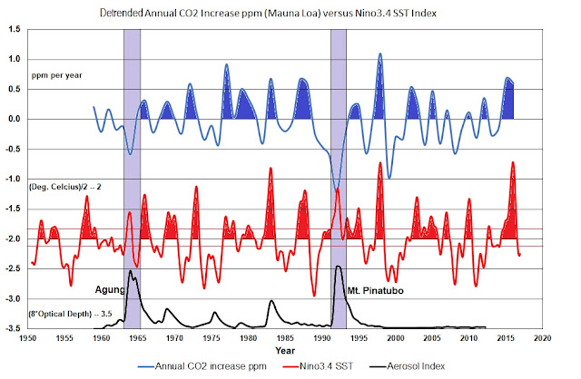
Here is the plot that shows the annual increase in CO2 [measured in parts per million - ppm] recorded at Mauna Loa (Hawaii) from 1959 and 2016. A least-squares line-of-best-fit is superimposed upon the the data (red line). Visible on the right-hand side of the plot is the so-called "unprecedented" peak in annual CO2 increase for the years 2015 and 2016.
Ref: NOAA Earth Systems Research Laboratory (ESRL) Global Monitoring Division - Trends in Atmospheric Carbon Dioxide - Annual Mean Growth Rate Mauna Loa Hawaii: https://www.esrl.noaa.gov/gmd/ccgg/trends/gr.html
Ref: NOAA Earth Systems Research Laboratory (ESRL) Global Monitoring Division - Trends in Atmospheric Carbon Dioxide - Annual Mean Growth Rate Mauna Loa Hawaii: https://www.esrl.noaa.gov/gmd/ccgg/trends/gr.html
It is immediately evident that the claim that level of CO2 in "unprecedented" is false because it does not take into account fact that there is more than one factor that is contributing to the annual change in CO2. Firstly, there is a slow increase in magnitude of the annual change in CO2 that is roughly linear with time. Secondly, there are short-term fluctuations in the annual change in CO2 that take place over a year or two.
If the red line in the figure above is used to remove the long-term changes in the annual increase in CO2 [This is the equivalent of the tin-foil hat alarmists tilting their heads 21 degrees to the left], you get the curve for the de-trended annual change in CO2 (measured in ppm) that is displayed at the top the following figure.

What this curve shows is that the recent increase in the annual change in CO2 in 2015 and 2016 are not unprecedented when compared to earlier increases, provided allowance is made for a slowly increasing linear rise in the annual change in CO2 over the last 57 years.
A second curve is displayed below the top curve of this figure that shows the NINO3.4 sea-surface temperatures (SST) anomalies. These SST anomalies can be used to determine when El Nino events are occurring in the Pacific Ocean. The timing of these El Nino events are highlighted in red.
Ref: The Month Nino3.4 SST Anomaly from NOAA:
http://www.cpc.ncep.noaa.gov/data/indices/sstoi.indices
A comparison between the top and middle curve in the above figure, clearly shows that on every occasion between 1959 and 2016 when there has been an El Nino event, it has been accompanied by a corresponding increase in the annual change in CO2, with two exception. The two exceptions are the El Nino events in 1964 and 1991.
The bottom curve in the above figure shows the stratospheric aerosol optical depth at 550 nm. This index is excellent indicator of recent major volcanic eruptions that have taken place in the tropical region of the planet. There are three main eruptions that are evident in this time series i.e. the eruptions in 1964 (Agung), 1983 (El Chichon) and 1991 (Mt. Pinatubo). Each of these eruptions injected massive amounts of aerosols (mainly sulphur dioxide) into the stratosphere that led to the significant cooling of global atmospheric and (to a lesser extent) oceanic temperatures over following 1 - 2 years.
Ref: Stratospheric aerosol optical depth at 550 nm used in GISS climate simulations
https://data.giss.nasa.gov/modelforce/strataer/tau.line_2012.12.txt
A comparison of this curve with the two above it clearly shows that the cooling associated with the two largest volcanic eruptions (Agung - 1964 and Mt. Pinatubo - 1991) completely reversed any increases in the annual change in CO2 caused by the El Nino events of 1964 and 1982/83.
Hence it is reasonable to conclude that:
a) virtually all of the variance in the annual change in CO2 on time scales
less than about 2 years can be attributed to the El Nino/La Nina ENSO
weather cycle.
b) the increases in the annual change in CO2 in 2015 and 2016 were just
what you would expect given the major 2015/16 El Nino event i.e. these
were in no way extraordinary.
c) there is an underlying long-term increase in the annual change in
atmospheric CO2 concentration that could be attributed to human CO2
emissions.
One thing that is clear from the two figure above, is that there is a natural source/sink of CO2 that can be associated with the El Nino/La Nina ENSO phenomenon that is significantly contributing to the short time scale (< 2 years) increase in the annual change in CO2.
Another factor that the NYT article doesn't take into account is that atmospheric concentration of CO2 (measured in ppm) has increase from about 316 ppm in 1959 to about 404 ppm in 2016.

 It also shows that the long-term increase in the annual change in CO2 is probably not taking place in a smooth linear fashion, as would be expected if human CO2 emissions were the primary contributor, but is in fact occurring in distinct step-like increases that last for about 18 to 20 years [note the steps at 1978 and 1997/98 El Nino events.
This step-like increases are also seen in the world's sea surface temperatures, as the following graph from a blog post Bob Tisdale shows:
Ref: https://bobtisdale.files.wordpress.com/2013/11/04-row.png

The bottom curve in the above figure shows the stratospheric aerosol optical depth at 550 nm. This index is excellent indicator of recent major volcanic eruptions that have taken place in the tropical region of the planet. There are three main eruptions that are evident in this time series i.e. the eruptions in 1964 (Agung), 1983 (El Chichon) and 1991 (Mt. Pinatubo). Each of these eruptions injected massive amounts of aerosols (mainly sulphur dioxide) into the stratosphere that led to the significant cooling of global atmospheric and (to a lesser extent) oceanic temperatures over following 1 - 2 years.
Ref: Stratospheric aerosol optical depth at 550 nm used in GISS climate simulations
https://data.giss.nasa.gov/modelforce/strataer/tau.line_2012.12.txt
A comparison of this curve with the two above it clearly shows that the cooling associated with the two largest volcanic eruptions (Agung - 1964 and Mt. Pinatubo - 1991) completely reversed any increases in the annual change in CO2 caused by the El Nino events of 1964 and 1982/83.
Hence it is reasonable to conclude that:
a) virtually all of the variance in the annual change in CO2 on time scales
less than about 2 years can be attributed to the El Nino/La Nina ENSO
weather cycle.
b) the increases in the annual change in CO2 in 2015 and 2016 were just
what you would expect given the major 2015/16 El Nino event i.e. these
were in no way extraordinary.
c) there is an underlying long-term increase in the annual change in
atmospheric CO2 concentration that could be attributed to human CO2
emissions.
One thing that is clear from the two figure above, is that there is a natural source/sink of CO2 that can be associated with the El Nino/La Nina ENSO phenomenon that is significantly contributing to the short time scale (< 2 years) increase in the annual change in CO2.
Another factor that the NYT article doesn't take into account is that atmospheric concentration of CO2 (measured in ppm) has increase from about 316 ppm in 1959 to about 404 ppm in 2016.

This means that if we are to make a valid comparison between annual increases in atmospheric CO2 over the full 57 year period, we must allow for the significant change in atmospheric CO2 concentration over this time period.
In this vane, the following plot shows the annual percentage increase in atmospheric CO2 at Mauna Loa Hawaii between 1959 and 2016. This plot re-emphasizes the point made earlier that [in terms of percentage change] the increases in the annual change in CO2 are not out of the ordinary compared to previous EL Nino events .

This step-like increases are also seen in the world's sea surface temperatures, as the following graph from a blog post Bob Tisdale shows:
Ref: https://bobtisdale.files.wordpress.com/2013/11/04-row.png

This plot shows the mean sea-surface temperature anomalies for the Atlantic, Indian and Pacific Oceans between 1982 and 2014.
A comparison of this figure with the figure above it shows that the long-term percentage increase in the annual change in atmospheric CO2 appears to be showing the same step-like increase as the lower troposphere temperatures - strongly suggesting that that there may be sources and sinks of CO2 that are NOT only associated with human emissions of CO2 but which are (also) most likely related in some way to these sea-surface temperature changes.
If this is true then this blows the whole human-induced, CO2-driven climate change model out of the water, strongly implying that human emissions only play a minor role. This would be agreement with the work of Bob Tisdale and Dr. Murray Salby.
The reader is referred to an excellent set of article by Bob Tisdale on this topic:
What Causes Sea Surface Temperature (SST) To Rise?
and a video by Dr. Salby at:
New video: Dr. Murry Salby – Control of Atmospheric CO2
The extract from the New York Times' article:
Justin Gillis reports that:
"For more than two years, the monitoring station here [in Tasmania] , along with its counterparts across the world, has been flashing a warning: The excess carbon dioxide scorching the planet rose at the highest rate on record in 2015 and 2016. A slightly slower but still unusual rate of increase has continued into 2017.
Scientists are concerned about the cause of the rapid rises because, in one of the most hopeful signs since the global climate crisis became widely understood in the 1980's, the amount of carbon dioxide that people are pumping into the air seems to have stabilized in recent years, at least judging from the data that countries compile on their own emissions.
That raises a conundrum: If the amount of the gas that people are putting out has stopped rising, how can the amount that stays in the air be going up faster than ever? Does it mean the natural sponges that have been absorbing carbon dioxide are now changing?
In essence, these natural sponges were doing humanity a huge service by disposing of much of its gaseous waste. But as emissions have risen higher and higher, it has been unclear how much longer the natural sponges will be able to keep up."
and he further reports that:
"Many of them suspect an El Niño climate pattern that spanned those two years, one of the strongest on record, may have caused the faster-than-usual rise in carbon dioxide, by drying out large parts of the tropics. The drying contributed to huge fires in Indonesia in late 2015 that sent a pulse of carbon dioxide into the atmosphere. Past
El Niños have also produced rapid increases in the gas, though not as large as the recent ones.
Yet scientists are not entirely certain that the El Niño was the main culprit; the idea cannot explain why a high rate of increase in carbon dioxide has continued into 2017, even though the El Niño ended early last year."