Sunday, December 24, 2017

Further Evidence That the Orbital Periods of the Planets Determine the Timing for Solar Maxima and Minima.


     Figure 2a shows the position angle of Jupiter measured from the alignment axis of the superior conjunction of Venus and Earth plotted against the position angle of Jupiter measured from the alignment axis of the inferior conjunction of Venus and Earth. The inferior and superior conjunctions chosen as the x,y coordinates for each point in this graph are those that are closest to a given solar maximum, for all solar maxima since 1700 A.D. The dates of solar maxima that are used are those published by Usoskin and Mursala (2003).

     Figure 2b shows the corresponding plot for position angles of Jupiter at the superior and inferior conjunctions closest to each of the solar minima since 1700 A.D. Again, the dates of solar minima are those published by Usoskin and Mursala (2003). In both figure 2a and figure 2b, symbols have been used to segregate the points into the 14 even and 14 odd numbered solar sunspot cycles.


A comparison between figure 2a and 2b shows that there is a marked segregation between the position angles of Jupiter at solar maximum compared to solar minimum. When Venus and the Earth are at inferior conjunction, at a given solar maximum, the position angle of Jupiter either lies between 60O and 90O or 0O and 30O, and when Venus and the Earth are at superior  conjunction, for the same solar maximum, the position angle of Jupiter is the complement of that angle. This is in marked contrast with the situation at solar minimum when the position angles of Jupiter lie almost exclusively between 30O and 60O for both inferior and superior conjunctions of Venus and the Earth.


     What is even more remarkable, however, is the complete separation between the odd and even cycles at solar maximum that can be seen in figure 2a. This means that Jupiter's position angle, at the time of alignments of Venus, Earth and the Sun, are completely different for even solar maxima than they are for odd solar maxima. Figure 3a shows Jupiter's position for inferior and superior conjunctions of Venus and the Earth, at times of even numbered solar maxima, while figure 3b shows Jupiter's position at the times of odd numbered solar maxima.

Reference:

Wilson, I.R.G., 2011, Do Periodic peaks in the Planetary Tidal 
Forces Acting Upon the Sun Influence the Sunspot Cycle? 
The General Science Journal, Dec 2011, 3812.


[Note: This paper was actually written by October-November 2007 and submitted to the New Astronomy (peer-reviewed) Journal in early 2008 where it was rejected for publication. It was resubmitted to the (peer-reviewed) PASP Journal in 2009 where it was again rejected. The paper was eventually published in the (non-peer reviewed) General Science Journal in 2010.]

Tuesday, December 12, 2017

The Dec-January-February Zonal N=4 Standing Wave in the SST and MSLP Anomalies of the Southern Hemisphere are Back!

Nikolay Sidorenkov and I published a paper in 2013 that showed that a zonal N=4 standing wave-like pattern appears in the December-January-February Sea-Surface Temperature (SST) anomalies and Mean Sea-Level Pressure (MSLP) anomalies found in the mid-latitudes of the Southern Hemisphere.


Figure 1


These SST anomalies are produced by the periodic reinforcement of the four semi-permanent high pressure cells that are located in the Southern Hemisphere's Sub-Tropical High Pressure Ridge, as shown in figure 1. The standing wave pattern reappears roughly once every 8 - 9 years in parallel sequences that are shifted with respect to each other by ~ 3 years.

Figure 2 shows the zonal pressure anomaly profiles for some of the more prominent zonal N=4 standing wave-like patterns between 1976 and 2010.


Figure 2.


Columns A and B of table 1 below identify all of the major zonal N=4 standing wave-like events since 1947. with the last two being in 2007 and 2010.


If the observed periodicity were to continue, you would expect to see the N=4 standing wave pattern in the SST and MSLP anomalies to re-emerge in months of December-January-February 2014-15 and 2017-18. It now appears that this is indeed the case.

Here it is in mid-January 2015:


and it is just starting to appear (roughly 3 years later) in December 2017:


The zonal N=4 standing wave-like pattern in the MSLP anomaly is being produced by lunar-induced atmospheric tides that circle the Earth roughly once every 18 years. These tides periodically re-enforce the strength of the four semi-permanent high pressure cells in the sub-tropical high pressure ridge (during the Southern Summer months of December-January-February) that produce localized heating of the SST's on their western sides. The semi=permanent pressure cells are normally located over NZ, and the eastern South Indian, South Atlantic and South Pacific Oceans.

Here we have proof of the effect of astronomical influences (in this case the lunar atmospheric tides) upon the Earth's climate.

UPDATE: 19/12/2017

SST Anomaly 19/12/2017 showing the prominent N=4 standing-wave like pattern. Four "H" symbols are superimposed on this plot to show the location of the enhanced semi-permanent high pressure cells in the Southern Sub-Tropical High Pressure Ridge. 


Tuesday, October 10, 2017

World wind speeds have slowed down over the last few decades ------- I wonder why?

I believe that the 59.75-year lunar tidal cycle associated with the most extreme Perigean New/Full moons is responsible for the ~ 60-year cycle seen in the Walker Circulation's influence upon the equatorial/tropical trade-winds and the ~ 60 year cycle in the All India Summer Monsoon Rainfall.    


File created: Thursday, ‎2 ‎June ‎2011, ‏‎4:04:54 PM
The lower part of this graph is a reproduction of a figure that I created in 2008.


1. In the lower graph, increased trade wind strength in the Cariaco Basin of Venezuela produces a greater concentration of G.Bulloides in the basin sediments i.e. increased trade wind strength is up in this diagram.

2. The strength of the trade winds in the equatorial Atlantic Ocean is inversely correlated with the trade wind strength in the central and western Pacific Oceans – because of the Walker circulation.

3.

https://www.eurekalert.org/pub_releases/2014-08/uoh-aoo073114.php


reports that a warming of the equatorial Atlantic Ocean since 1990’s has led to drop in atmospheric pressure over the equatorial Atlantic. This pumps air [via the Walker cell between the equatorial Atlantic and the eastern Pacific Ocean] into the eastern Pacific, leading to a strengthening of the trade winds across the equatorial Pacific. The stronger trade winds lead to greater upwelling of cold water in the eastern equatorial Pacific, which reinforces the atmospheric pressure (and seas surface temperature) difference between the equatorial parts of two oceans.


4. The intensified Walker cell bridging the two oceans produces increasing pressure over the eastern Pacific which attenuates the trade winds that are blowing towards the west off the coast of Venezuela. This means that the trade wind strength in the Cariaco Basin of Venezuela vary 180 degrees out of phase with the strength of the trade winds in the central and western equatorial Pacific oceans.


You can see this in the lower graph in the above post. From the late 1980’s onward, there is a rapid drop in the trade wind strength in the Cariaco Basin which is matched by a rapid increase in the trade wind strength in the western equatorial Pacific.


N.B. This means that the All India Summer Monsoon rainfall peaks when the trade winds are strongest in the central to Western Pacific Oceans and weakest in the Cariaco Basin of Venezuela.

Saturday, July 22, 2017

Pro Tip: Tin-Foil Hat Alarmists Tilt Your Heads 21 Degrees to the Left!!

The New York Times is trying to create a global-warming scare campaign by claiming that the large increases in the amounts of CO2 in the Earth's atmosphere in 2015 and 2016 are unprecedented and that they [possibly] signal an ominous change in the balance between the natural sources and sinks of carbon in the environment. The reporter Justin Gillis mentions that unusually high increases in CO2 in 2015 and 2016 may have something to do with the effects of the 2015/16 El Nino, though he quickly downplays this explanation because it detracts from the scare campaign that he trying to promote.


This post shows that most of what is being reported in the NYT on this topic is FAKE NEWS


Carbon in Atmosphere Is Rising, Even as Emissions Stabilize
Justin Gillis June 26th, 2017 NYT

The reader can read an extract from the article at the end of this post and the full article at:


Now let's look at the real facts.


Here is the plot that shows the annual increase in CO2 [measured in parts per million - ppm] recorded at Mauna Loa (Hawaii) from 1959 and 2016.  A least-squares line-of-best-fit is superimposed upon the the data (red line). Visible on the right-hand side of the plot is the so-called "unprecedented" peak in annual CO2 increase for the years 2015 and 2016. 

Ref: NOAA Earth Systems Research Laboratory (ESRL) Global Monitoring Division - Trends in Atmospheric Carbon Dioxide - Annual Mean Growth Rate Mauna Loa Hawaii:  https://www.esrl.noaa.gov/gmd/ccgg/trends/gr.html

It is immediately evident that the claim that level of CO2 in "unprecedented" is false because it does not take into account fact that there is more than one factor that is contributing to the annual change in CO2. Firstly, there is a slow increase in magnitude of the annual change in CO2 that is roughly linear with time. Secondly, there are short-term fluctuations in the annual change in CO2 that take place over a year or two. 

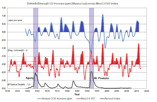
If the red line in the figure above is used to remove the long-term changes in the annual increase in CO2 [This is the equivalent of the tin-foil hat alarmists tilting their heads 21 degrees to the left], you get the curve for the de-trended annual change in CO2 (measured in ppm) that is displayed at the top the following figure.   


What this curve shows is that the recent increase in the annual change in CO2 in 2015 and 2016 are not unprecedented when compared to earlier increases, provided allowance is made for a slowly increasing linear rise in the annual change in CO2 over the last 57 years.

A second curve is displayed below the top curve of this figure that shows the NINO3.4 sea-surface temperatures (SST) anomalies. These SST anomalies can be used to determine when El Nino events are occurring in the Pacific Ocean. The timing of these El Nino events are highlighted in red.

Ref: The Month Nino3.4 SST Anomaly from NOAA: 
http://www.cpc.ncep.noaa.gov/data/indices/sstoi.indices

A comparison between the top and middle curve in the above figure, clearly shows that on every occasion between 1959 and 2016 when there has been an El Nino event, it has been accompanied by a corresponding increase in the annual change in CO2, with two exception. The two exceptions are the El Nino events in 1964 and 1991.

The bottom curve in the above figure shows the stratospheric aerosol optical depth at 550 nm. This index is excellent indicator of recent major volcanic eruptions that have taken place in the tropical region of the planet. There are three main eruptions that are evident in this time series i.e. the eruptions in 1964 (Agung), 1983 (El Chichon) and 1991 (Mt. Pinatubo). Each of these eruptions injected massive amounts of aerosols (mainly sulphur dioxide) into the stratosphere that led to the significant cooling of global atmospheric and (to a lesser extent) oceanic temperatures over following 1 - 2 years.

Ref: Stratospheric aerosol optical depth at 550 nm used in GISS climate simulations

https://data.giss.nasa.gov/modelforce/strataer/tau.line_2012.12.txt

A comparison of this curve with the two above it clearly shows that the cooling associated with the two largest volcanic eruptions (Agung - 1964 and Mt. Pinatubo - 1991)  completely reversed any increases in the annual change in CO2 caused by the El Nino events of 1964 and 1982/83.

Hence it is reasonable to conclude that:

a) virtually all of the variance in the annual change in CO2 on time scales
    less than about 2 years can be attributed to the El Nino/La Nina ENSO
    weather cycle.

b) the increases in the annual change in CO2 in 2015 and 2016 were just
      what you would expect given the major 2015/16 El Nino event i.e. these
      were in no way extraordinary.  

c) there is an underlying long-term increase in the annual change in
     atmospheric CO2 concentration that could be attributed to human CO2
    emissions.

One thing that is clear from the two figure above, is that there is a natural source/sink of CO2 that can be associated with the El Nino/La Nina ENSO phenomenon that is significantly contributing to the short time scale (< 2 years) increase in the annual change in CO2. 

Another factor that the NYT article doesn't take into account is that atmospheric concentration of CO2 (measured in ppm) has increase from about 316 ppm in 1959 to about 404 ppm in 2016. 


This means that if we are to make a valid comparison between annual increases in atmospheric CO2 over the full 57 year period, we must allow for the significant change in atmospheric CO2 concentration over this time period.

In this vane, the following plot shows the annual percentage increase in atmospheric CO2 at Mauna Loa Hawaii between 1959 and 2016. This plot re-emphasizes the point made earlier that [in terms of percentage change] the increases in the annual change in CO2 are not out of the ordinary compared to previous EL Nino events .       

  
It also shows that the long-term increase in the annual change in CO2 is probably not taking place in a smooth linear fashion, as would be expected if human CO2 emissions were the primary contributor, but is in fact occurring in distinct step-like increases that last for about 18 to 20 years [note the steps at 1978 and 1997/98 El Nino events.

This step-like increases are also seen in the world's sea surface temperatures, as the following graph from a blog post Bob Tisdale shows:

Ref: https://bobtisdale.files.wordpress.com/2013/11/04-row.png


This plot shows the mean sea-surface temperature anomalies for the Atlantic, Indian and Pacific Oceans between 1982 and 2014. 

A comparison of this figure with the figure above it shows that the long-term percentage increase in the annual change in atmospheric CO2 appears to be showing the same step-like increase as the lower troposphere temperatures - strongly suggesting that that there may be sources and sinks of CO2 that are NOT only associated with human emissions of CO2 but which are (also) most likely related in some way to these sea-surface temperature changes.


If this is true then this blows the whole human-induced, CO2-driven climate change model out of the water, strongly implying that human emissions only play a minor role. This would be agreement with the work of Bob Tisdale and Dr. Murray Salby.


The reader is referred to an excellent set of article by Bob Tisdale on this topic:

What Causes Sea Surface Temperature (SST) To Rise?


and a video by Dr. Salby at:

New video: Dr. Murry Salby – Control of Atmospheric CO2


The extract from the New York Times' article:

Justin Gillis reports that:

"For more than two years, the monitoring station here [in Tasmania] , along with its counterparts across the world, has been flashing a warning: The excess carbon dioxide scorching the planet rose at the highest rate on record in 2015 and 2016. A slightly slower but still unusual rate of increase has continued into 2017.

Scientists are concerned about the cause of the rapid rises because, in one of the most hopeful signs since the global climate crisis became widely understood in the 1980's, the amount of carbon dioxide that people are pumping into the air seems to have stabilized in recent years, at least judging from the data that countries compile on their own emissions. 

That raises a conundrum: If the amount of the gas that people are putting out has stopped rising, how can the amount that stays in the air be going up faster than ever? Does it mean the natural sponges that have been absorbing carbon dioxide are now changing?

To me, it’s a warning,” said Josep G. Canadell, an Australian climate scientist who runs the Global Carbon Project, a collaboration among several countries to monitor emissions trends. Scientists have spent decades measuring what was happening to all of the carbon dioxide that was produced when people burned coal, oil and natural gas. They established that less than half of the gas was remaining in the atmosphere and warming the planet. The rest was being absorbed by the ocean and the land surface, in roughly equal amounts.

In essence, these natural sponges were doing humanity a huge service by disposing of much of its gaseous waste. But as emissions have risen higher and higher, it has been unclear how much longer the natural sponges will be able to keep up."

and he further reports that:

"Many of them suspect an El Niño climate pattern that spanned those two years, one of the strongest on record, may have caused the faster-than-usual rise in carbon dioxide, by drying out large parts of the tropics. The drying contributed to huge fires in Indonesia in late 2015 that sent a pulse of carbon dioxide into the atmosphere. Past 
El Niños have also produced rapid increases in the gas, though not as large as the recent ones.

Yet scientists are not entirely certain that the El Niño was the main culprit; the idea cannot explain why a high rate of increase in carbon dioxide has continued into 2017, even though the El Niño ended early last year."

Thursday, April 20, 2017

I Need Some Help to Solve an Interesting Lunar Puzzle

The Conundrum

[N.B. A Full Moon Cycle (FMC = 411.78443025 days epoch J2000.0) is the time required for the Sun (as seen from the Earth) to complete one revolution with respect to the Perigee of the Lunar orbit. In other words, it is the time between repeat occurrences of the Perigee end of the lunar line-of-apse pointing at the Sun. The value for the length of the FMC is equal to the synodic product of the Synodic (lunar phase) month (= 29.530588853 days) with the anomalistic month (= 27.554549878 days) for Epoch J2000.0. The anomalist month is the time required for the Moon to return to the Perigee of the lunar orbit.]  

[N.B. The Lunar Anomalistic Cycle (LAC = 3232.60544062 days = 8.85023717 sidereal years) is the time required for the lunar line-of-apse to precess once around the sky with respect to the stars. This corresponds to a 0.11136528O per day movement of the lunar line-of-apse in a pro-grade (clockwise) direction. The value for the length of the LAC is equal to the synodic product of the anomalistic month (= 27.554549878 days) with the sidereal lunar month (= 27.231661547 days) for Epoch J2000.0. The sidereal month is the time required for the Moon to rotate once around its orbit with respect to the stars.]  

The diagram below shows the Perigee of the lunar orbit pointing at the Sun at 0.0 days. In addition, the diagram shows the Perigee of the lunar orbit once again pointing at the Sun after one Full Moon Cycle (FMC) = 411.78443025 days. It takes more than 1.0 sidereal year (= 365.256363004 days) for the Perigee to realign with the Sun because of the slow pro-grade (clockwise) precession of the lunar line-of-apse once every 8.85023717 sidereal years.


1.0 FMC falls short of 15 anomalistic months (= 413.31824817 days) by 1.53381792 days (= 1.5117449198O). During these 1.5117449198 days the Perigee end of the lunar line-of-apse rotates by 0.17081406in a prograde direction, producing an overall movement of the line-of-apse (red line) of 1.34093086O (= 1.5117449198O – 0.17081406O) with respect to the Earth-Sun line (blue line).

if we let:

  DT  =  (15 anomalistic months -- FMC) = (413.31824817 -- 411.78443025) days 
         = 1.53381792 days
      S = the angular revolution (in degrees) of the Earth about the Sun over DT days.
          = 1.5117449198 degrees
      L = the orbital precession (in degrees) of the lunar line-of-apse over DT days.
          = 0.1708140574 degrees
then  

      D = S -- L = angle between the lunar line-of-apse and the Earth-Sun line after DT days.
          = 1.3409308624 degrees

we find that if we take the incremental angle between the lunar line-of-apse and the Earth-Sun line over DT days (= 1.3409308624 degrees) and divide it by the 360 degrees of movement of the angle between the lunar line-of-apse and the Earth-Sun line that has occurred over the previous FMC, it effectively has the same value as the incremental number of days between 15 anomalistic months and 1.0 FMC (=1.5338172 days) divided by 1.0 FMC i.e.    

     (S -- L) / 360 degrees = (15 anomalistic months - FMC) / FMC = 0.0037248080            (1)

While this is not remarkable, what is remarkable, however, is that both of these fractions (whether they be measured in degrees or days) are precisely equal to the cumulative annual precession of the Perihelion of the Earth's orbit (measured in days) over a period of 1.0 FMC!

= (11.723"/3600) deg. per yr x (365.256363004 days / 360 deg.) x (411.78443025 / 365.256363004)
= 0.0037248062 days per 1.127384686 sidereal years.

N.B. The current value for the precession of the Perihelion of the Earth's orbit is 11.615 arc seconds per year. However it is increasing and will achieve a value of 11.723 arc seconds in roughly 2490 A.D.   

Here's the Rub [updated 25/04/2017]

1. The cumulative precession of the Earth's orbit over a period of 1.0 FMC has the dimensions of days per year!

I must be missing something. Why the strange units of days per 1.127384686 sidereal years? Can anyone help me understand why I get these weird dimensionless units? [updates 22/04/2017]

2.  The increase in angle between the lunar line-of-apse and the Earth-Sun line as you move from 1.0 FMC to 15 anomalistic months (= 1.34093086 degrees) seems to be almost precisely equal to the FULL annual precession of the Perihelion of the Earth's orbit (= 11.723 arc seconds per year) PER DAY accumulate over 1.0 FMC i.e.

[(11.723 / 3600) deg per YEAR] x 411.78443025 days = 1.34093024 degrees

The question is, what angular motion associated with the movements in Sun-Earth-Moon system can cause the ANNUAL precession of the Perihelion of the Earth's orbit to accumulate DAILY?

I am not aware of any mechanism that would produce a motion like this and I would appreciate if anyone could solve this interesting lunar puzzle for me!

Is it something to to do with the interaction between the mean and true anomalies of the Earth's orbit and the Moon's orbit? Could motion of the Earth and moon about the common centre-of-gravity have and effect? What about the effects of 18.6 year nutation of the Earth's rotation axis?

THANKS IN ADVANCE